
Google did an amazing job to promote material design. However there is not many articles about how to quickly style the custom dialog. So, we will cover some missing stuff here.
Prerequisites
Add material design dependency in Gradle file:
implementation "com.google.android.material:material:<latest-version>"Make sure your AppTheme inherited from a material theme like:
<style name="AppTheme" parent="Theme.MaterialComponents.Light.DarkActionBar">Customization
Dialogs inform users about a task and can contain critical information, require decisions, or involve multiple tasks. The contents within a dialog should follow their own accessibility guidelines, such as an icon on a title having a content description via the android:contentDescription attribute set in the MaterialAlertDialog.MaterialComponents.Title.Icon style or descendant.
Create a custom alert dialog theme that inherited from ThemeOverlay.MaterialComponents.MaterialAlertDialog:
<style name="AlertDialogTheme" parent="ThemeOverlay.MaterialComponents.MaterialAlertDialog"></style>Then you can then customize the style of the title, body, button, or other elements by overriding the corresponding item in the alert dialog theme.
For example, customize the text color and font size of the title by creating a materialAlertDialogTitleTextStyle that inherited from MaterialAlertDialog.MaterialComponents.Title.Text:
<style name="AlertDialogTheme" parent="...">
    <item name="materialAlertDialogTitleTextStyle">@style/TitleTextStyle</item>
</style>
<style name="TitleTextStyle" parent="MaterialAlertDialog.MaterialComponents.Title.Text">
    <item name="android:textColor">#fafafa</item>
    <item name="android:textSize">20sp</item>
</style>
Examples
Example 1:
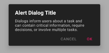
Change the background colour and define the style for title text, body text, positive and negative button:
<style name="AlertDialogTheme" parent="ThemeOverlay.MaterialComponents.MaterialAlertDialog">
    <item name="colorSurface">#212121</item>
    <item name="materialAlertDialogTitleTextStyle">@style/TitleTextStyle</item>
    <item name="materialAlertDialogBodyTextStyle">@style/BodyTextStyle</item>
    <item name="buttonBarPositiveButtonStyle">@style/PositiveButtonStyle</item>
    <item name="buttonBarNegativeButtonStyle">@style/NegativeButtonStyle</item>
</style>
<style name="TitleTextStyle" parent="MaterialAlertDialog.MaterialComponents.Title.Text">
    <item name="android:textColor">#fafafa</item>
    <item name="android:textStyle">bold</item>
    <item name="android:textSize">20sp</item>
</style>
<style name="BodyTextStyle" parent="MaterialAlertDialog.MaterialComponents.Body.Text">
    <item name="android:textColor">#c7c7c7</item>
    <item name="android:textSize">14sp</item>
</style>
<style name="PositiveButtonStyle" parent="Widget.MaterialComponents.Button.TextButton.Dialog">
    <item name="android:textColor">#d81b60</item>
    <item name="rippleColor">#ad1457</item>
</style>
<style name="NegativeButtonStyle" parent="Widget.MaterialComponents.Button.TextButton.Dialog">
    <item name="android:textColor">#757575</item>
    <item name="rippleColor">#a4a4a4</item>
</style>
To apply the custom theme to the dialog you need to use the MaterialAlertDialogBuilder and pass the theme id to it:
MaterialAlertDialogBuilder(context, R.styles.AlertDialogTheme)
    .setTitle(R.string.title)
    .setMessage(R.string.message)
    .setPositiveButton(R.string.positive, ...)
    .setNegativeButton(R.string.negative, ...)
    .create()
So, if you want to let every dialog use the same theme, then override the materialAlertDialogTheme attribute it in your AppTheme:
<style name="AppTheme" parent="Theme.MaterialComponents.Light.DarkActionBar">
    <item name="materialAlertDialogTheme">@style/AlertDialogTheme</item>
</style>
Now the context will provide custom dialog theme instead of the default one. You can initialize the dialog builder without the theme parameter:
MaterialAlertDialogBuilder(context).setTitle()...Example 2:
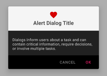
Let the title and icon center and set different colors to title pane and button bar:
<style name="AlertDialogTheme.Center" parent="ThemeOverlay.MaterialComponents.MaterialAlertDialog">
    <item name="colorSurface">#212121</item>
    <item name="materialAlertDialogTitlePanelStyle">@style/TitlePaneStyleCenter</item>
    <item name="materialAlertDialogTitleTextStyle">@style/TitleTextStyleCenter</item>
    <item name="materialAlertDialogTitleIconStyle">@style/TitleIconStyleCenter</item>
    <item name="materialAlertDialogBodyTextStyle">@style/BodyTextStyleCenter</item>
    <item name="buttonBarStyle">@style/ButtonBarStyle</item>
    <item name="buttonBarPositiveButtonStyle">@style/PositiveButtonStyle</item>
    <item name="buttonBarNegativeButtonStyle">@style/NegativeButtonStyle</item>
</style>
<style name="TitlePaneStyleCenter" parent="MaterialAlertDialog.MaterialComponents.Title.Panel.CenterStacked">
    <item name="android:background">#f5f5f5</item>
    <item name="android:padding">16dp</item>
</style>
<style name="TitleIconStyleCenter" parent="MaterialAlertDialog.MaterialComponents.Title.Icon.CenterStacked">
    <item name="android:tint">#d50000</item>
</style>
<style name="TitleTextStyleCenter" parent="MaterialAlertDialog.MaterialComponents.Title.Text.CenterStacked">
    <item name="android:textColor">#484848</item>
    <item name="android:textStyle">bold</item>
    <item name="android:textSize">20sp</item>
</style>
<style name="BodyTextStyleCenter" parent="MaterialAlertDialog.MaterialComponents.Body.Text">
    <item name="android:padding">16dp</item>
    <item name="android:textColor">#c7c7c7</item>
    <item name="android:textSize">14sp</item>
</style>
<style name="ButtonBarStyle">
    <item name="android:background">#000000</item>
</style>
Conclusion
MaterialAlertDialog provides a beautiful base style and you can easily customize the style with writing some XML. For more content of Android development please visit this link.
Thanks for your post! Always love the way you guide the audience through your posts!